[文章]【木棉花】轻松玩转HarmonyOS ArkUI 3.0 开发实战——合成1024


0
1
HarmonyOS ArkUI 3.0正式到来,今天就给大家分享一下我的HarmonyOS ArkUI 3.0 框架试玩初体验,以合成1024的开发实战,带大家感受一下HarmonyOS ArkUI 3.0的极简开发。
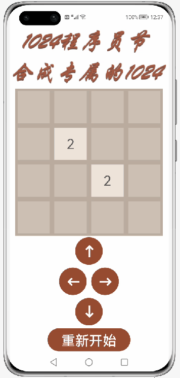
效果图
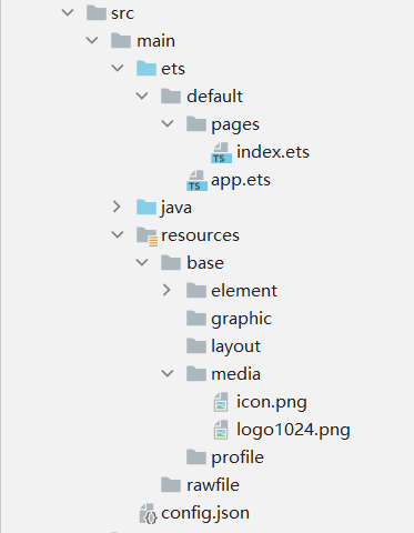
代码文件结构
正文一、创建一个空白的工程1. 安装和配置DevEco Studio
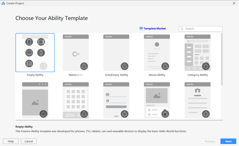
2. 创建一个Empty Ability应用
DevEco Studio下载安装成功后,打开DevEco Studio,点击左上角的File,点击New,再选择New Project,选择Empty Ability选项,点击Next按钮
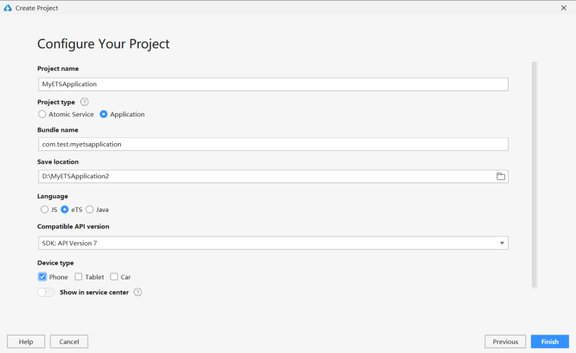
将文件命名为MyETSApplication(文件名不能出现中文或者特殊字符,否则将无法成功创建项目文件),Project Type勾选Application,选择保存路径,Language勾选eTS,选择API7,设备勾选Phone,最后点击Finish按钮。
在entry>src>main>config.json文件中最下方"launchType": "standard"的后面添加以下代码,这样就可以实现去掉应用上方的标签栏了。
config.json最下方部分代码:
- <!--StartFragment--><span class="token property">"metaData"</span><span class="token operator">:</span> <span class="token punctuation">{</span>
将logo图片保存到entry>src>main>resources>base>media文件中。

2. 新一代的声明式UI开发范式具体而言,ArkUI 3.0中的新一代声明式UI开发范式,主要特征如下:
(1)基于TypeScript扩展的声明式UI描述语法,提供了类自然语言的UI描述和组合。
(2)开箱即用的多态组件。多态是指UI描述是统一的,UI呈现在不同类型设备上会有所不同。比如Button组件在手机和手表会有不同的样式和交互方式。
(3)多维度的状态管理机制,支持灵活的数据驱动的UI变更。
- 装饰器:用来装饰类、结构体、方法以及变量,赋予其特殊的含义,如上述示例中@Entry、@Component、@State都是装饰器。@Component表示这是个自定义组件;@Entry则表示这是个入口组件;@State表示组件中的状态变量,这个状态变化会引起UI变更。
- 自定义组件:可复用的UI单元,可组合其它组件,如上述被@Component装饰的struct Hello。
- UI描述:声明式的方式来描述UI的结构,如上述build()方法内部的代码块。
- 内置组件:框架中默认内置的基础和布局组件,可直接被开发者调用,比如示例中的Column、Text、Divider、Button。
- 事件方法:用于添加组件对事件的响应逻辑,统一通过事件方法进行设置,如跟随在Button后面的onClick()。
- 属性方法:用于组件属性的配置,统一通过属性方法进行设置,如fontSize()、width()、height()、color()等,可通过链式调用的方式设置多项属性。
装饰器 @Entry 装饰的自定义组件用作页面的默认入口组件,加载页面时,将首先创建并呈现@Entry装饰的自定义组件。要注意的是:在单个源文件中,最多可以使用@Entry装饰一个自定义组件。
装饰器 @Component 装饰的struct表示该结构体具有组件化能力,能够成为一个独立的组件,这种类型的组件也称为自定义组件。该组件可以组合其他组件,它通过实现build方法来描述UI结构。
组件生命周期包括aboutToAppear、aboutToDisappear、onPageShow、onPageHide和onBackPress
- aboutToAppear:函数在创建自定义组件的新实例后,在执行其build函数之前执行。允许在aboutToAppear函数中改变状态变量,这些更改将在后续执行build函数中生效。
- aboutToDisappear:函数在自定义组件析构消耗之前执行。不允许在aboutToDisappear函数中改变状态变量,特别是@Link变量的修改可能会导致应用程序行为不稳定。
- onPageShow:当此页面显示时触发一次。包括路由过程、应用进入前后台等场景,仅@Entry修饰的自定义组件生效。
- onPageHide:当此页面消失时触发一次。包括路由过程、应用进入前后台等场景,仅@Entry修饰的自定义组件生效。
- onBackPress:当用户点击返回按钮时触发,,仅@Entry修饰的自定义组件生效。
装饰器 @State 装饰的变量是组件内部的状态数据,当这些状态数据被修改时,将会调用所在组件的build方法进行UI刷新。要注意的是,标记为@State的属性不能直接在组件外部修改,必须为所有@State变量分配初始值。
装饰器 @Link 装饰的变量可以和父组件的@State变量建立双向数据绑定。要注意的是,@Link变量不能在组件内部进行初始化,在创建组件的新实例时,必须使用命名参数初始化所有@Link变量。@Link变量可以使用@State变量或@Link变量的引用进行初始化。@State变量可以通过’$'操作符创建引用。
index.ets:
先定义一个方格的背景颜色字典colors,用以绘制不同数字的背景颜色,和一个全局变量number,用以ForEach的键值生成。
- var number = 1
- const colors={
- "0": "#CDC1B4",
- "2": "#EEE4DA",
- "4": "#ECE0C6",
- "8": "#F2B179",
- "16": "#F59563",
- "32": "#F67C5F",
- "64": "#F65E3B",
- "128": "#EDCF72",
- "256": "#EDCC61",
- "512": "#99CC00",
- "1024": "#83AF9B",
- "2048": "#0099CC",
- "4096": "#0099CC",
- "8192": "#0099CC"
- }
对于每一行组件,传统的方式是重复绘制4个Text组件,而且这些Text组件除了文本之外,其他属性值都是一样的,同样极其繁琐且没有必要,我们可以采用ForEach循环渲染来绘制:
- 第一个参数必须是数组:允许空数组,空数组场景下不会创建子组件。同时允许设置返回值为数组类型的函数,例如arr.slice(1, 3),设置的函数不得改变包括数组本身在内的任何状态变量,如Array.splice、Array.sort或Array.reverse这些原地修改数组的函数;
- 第二个参数用于生成子组件的lambda函数。它为给定数组项生成一个或多个子组件。单个组件和子组件列表必须括在大括号“{…}”中;
- 可选的第三个参数是用于键值生成的匿名函数。它为给定数组项生成唯一且稳定的键值。当子项在数组中的位置更改时,子项的键值不得更改,当数组中的子项被新项替换时,被替换项的键值和新项的键值必须不同。键值生成器的功能是可选的。但是,出于性能原因,强烈建议提供,这使开发框架能够更好地识别数组更改。如单击进行数组反向时,如果没有提供键值生成器,则ForEach中的所有节点都将重建。
使用装饰器@Component,自定义一个每一行的组件,用装饰器@Link定义一个数组grids。在build()里面添加弹性布局Flex,使用循环渲染ForEach来绘制组件Text。对于每一个Text组件,文本判断是否为0,如果值为0,则不显示,背景颜色采用刚才定义好的背景颜色字典colors对应的背景颜色,文本颜色判断其值是否为2或4,如果为2或4,则采用颜色#645B52,否则采用背景颜色白色。
- @Component
- struct setText {
- [url=home.php?mod=space&uid=41289]@Link[/url] grids: number[]
- build() {
- Flex({ justifyContent: FlexAlign.Center, alignItems: ItemAlign.Center, direction: FlexDirection.Row }) {
- ForEach(this.grids,
- (item: number) => Text(item == 0 ? '' : item.toString())
- .width(70)
- .height(70)
- .textAlign(TextAlign.Center)
- .fontSize(30)
- .margin({ left: 5, top: 5, right: 5, bottom: 5 })
- .backgroundColor(colors[item.toString()])
- .fontColor((item == 2 || item == 4) ? '#645B52' : '#FFFFFF'),
- (item: number) => (number++) + item.toString())
- }
- }
- }
- @Component
- struct setButton {
- private dirtext: string
- private dir: string
- @Link Grids: number[][]
- @Link grid1: number[]
- @Link grid2: number[]
- @Link grid3: number[]
- @Link grid4: number[]
- build() {
- Button(this.dirtext)
- .width(60)
- .height(60)
- .fontSize(30)
- .fontWeight(FontWeight.Bold)
- .align(Alignment.Center)
- .backgroundColor('#974B31')
- .fontColor('#FFFFFF')
- .margin({ left: 5, top: 3, right: 5, bottom: 3 })
- }
- }
使用装饰器@State定义一个二维数组和四个一维数组,添加垂直布局Column,宽和高都为100%,背景颜色为白色,在其中添加Image组件,引用刚才保存好的logo图片,再添加一个宽和高都是320,背景颜色为#BBADA0的垂直布局Column,在其添加四个刚才定义好的行组件setText。
在外围的垂直布局Column中再添加四个刚才定义好的按钮组件setButton,其中中间两个按钮组件位于弹性布局Flex中,最后添加一个Button组件,文本内容为“重新开始”。
- @Entry
- @Component
- struct Index {
- @State grids: number[][] = [[0, 0, 0, 0],
- [0, 2, 0, 0],
- [0, 0, 2, 0],
- [0, 0, 0, 0]]
- @State grid1: number[] = [this.grids[0][0], this.grids[0][1], this.grids[0][2], this.grids[0][3]]
- @State grid2: number[] = [this.grids[1][0], this.grids[1][1], this.grids[1][2], this.grids[1][3]]
- @State grid3: number[] = [this.grids[2][0], this.grids[2][1], this.grids[2][2], this.grids[2][3]]
- @State grid4: number[] = [this.grids[3][0], this.grids[3][1], this.grids[3][2], this.grids[3][3]]
- build() {
- Column() {
- Image($r('app.media.logo1024')).width('100%').height(140).align(Alignment.Center)
- Column() {
- setText({ grids: $grid1 })
- setText({ grids: $grid2 })
- setText({ grids: $grid3 })
- setText({ grids: $grid4 })
- }
- .width(320)
- .height(320)
- .backgroundColor("#BBADA0")
- setButton({dirtext: '↑', dir: 'up', Grids: $grids, grid1: $grid1, grid2: $grid2, grid3: $grid3, grid4: $grid4})
- Flex({ justifyContent: FlexAlign.Center, alignItems: ItemAlign.Center, direction: FlexDirection.Row }) {
- setButton({dirtext: '←', dir: 'left', Grids: $grids, grid1: $grid1, grid2: $grid2, grid3: $grid3, grid4: $grid4})
- setButton({dirtext: '→', dir: 'right', Grids: $grids, grid1: $grid1, grid2: $grid2, grid3: $grid3, grid4: $grid4})
- }
- setButton({dirtext: '↓', dir: 'down', Grids: $grids, grid1: $grid1, grid2: $grid2, grid3: $grid3, grid4: $grid4})
- Button('重新开始')
- .width(180)
- .height(50)
- .fontSize(30)
- .align(Alignment.Center)
- .backgroundColor('#974B31')
- .fontColor('#FFFFFF')
- .margin({ left: 5, top: 3, right: 5, bottom: 3 })
- }
- .width('100%')
- .height('100%')
- .backgroundColor("#FFFFFF")
- .alignItems(HorizontalAlign.Center)
- }
- }
index.ets:
在结构体setButton中添加四个函数:
addTwoOrFourToGrids():用以随机生成一个新的方格数字,数字为2或4。
swipeGrids(direction):用以实现方格的重新生成。
changeGrids(direction):用以实现方格的上下左右移动。
changeString():用以将二维数组分成四个一维数组。
最后在Button组件的属性里添加一个点击事件,依次调用函数swipeGrids(direction)、addTwoOrFourToGrids()和changeString()。
- @Component
- struct setButton {
- private dirtext: string
- private dir: string
- @Link Grids: number[][]
- @Link grid1: number[]
- @Link grid2: number[]
- @Link grid3: number[]
- @Link grid4: number[]
- addTwoOrFourToGrids() {
- let array = [];
- for (let row = 0; row < 4; row++)
- for (let column = 0;column < 4; column++)
- if (this.Grids[row][column] == 0)
- array.push([row, column]);
- let randomIndes = Math.floor(Math.random() * array.length);
- let row = array[randomIndes][0];
- let column = array[randomIndes][1];
- if (Math.random() < 0.8) {
- this.Grids[row][column] = 2;
- } else {
- this.Grids[row][column] = 4;
- }
- }
- swipeGrids(direction) {
- let newGrids = this.changeGrids(direction);
- if (newGrids.toString() != this.Grids.toString()) {
- this.Grids = newGrids;
- }
- }
- changeGrids(direction) {
- let newGrids = [[0, 0, 0, 0],
- [0, 0, 0, 0],
- [0, 0, 0, 0],
- [0, 0, 0, 0]];
- if (direction == 'left' || direction == 'right') {
- let step = 1;
- if (direction == 'right') {
- step = -1;//step作为循环时数组下标改变的方向
- }
- for (let row = 0; row < 4; row++) {//每一层
- let array = [];
- let column = 0;//如果为left则从0开始right从3开始,
- if (direction == 'right') {
- column = 3;
- }
- for (let i = 0; i < 4; i++) {
- if (this.Grids[row][column] != 0) {//把所有非零元依次放入数组中
- array.push(this.Grids[row][column]);
- }
- column += step;//当direction为left时则从0向3递增,为right时则从3向0递减
- }
- for (let i = 0; i < array.length - 1; i++) {//访问当前元素及他的下一个元素,所有循环次数为length-1
- if (array[i] == array[i + 1]) {//判断是否可合并,
- array[i] += array[i + 1];//合并,
- array[i + 1] = 0;//合并后参与合并的第二个元素消失
- i++;
- }
- }
- column = 0;
- if (direction == 'right') {
- column = 3;
- }
- for (const elem of array) {
- if (elem != 0) {//跳过array里的空元素
- newGrids[row][column] = elem;//把合并后的状态赋给新数组grids,
- column += step;
- }
- }
- }
- } else if (direction == 'up' || direction == 'down') {//同理
- let step = 1;
- if (direction == 'down') {
- step = -1;
- }
- for (let column = 0; column < 4; column++) {
- let array = [];
- let row = 0;
- if (direction == 'down') {
- row = 3;
- }
- for (let i = 0; i < 4; i++) {
- if (this.Grids[row][column] != 0) {
- array.push(this.Grids[row][column]);
- }
- row += step;
- }
- for (let i = 0; i < array.length - 1; i++) {
- if (array[i] == array[i + 1]) {
- array[i] += array[i + 1];
- array[i + 1] = 0;
- i++;
- }
- }
- row = 0;
- if (direction == 'down') {
- row = 3;
- }
- for (const elem of array) {
- if (elem != 0) {
- newGrids[row][column] = elem;
- row += step;
- }
- }
- }
- }
- return newGrids;
- }
- changeString() {
- this.grid1 = [this.Grids[0][0], this.Grids[0][1], this.Grids[0][2], this.Grids[0][3]]
- this.grid2 = [this.Grids[1][0], this.Grids[1][1], this.Grids[1][2], this.Grids[1][3]]
- this.grid3 = [this.Grids[2][0], this.Grids[2][1], this.Grids[2][2], this.Grids[2][3]]
- this.grid4 = [this.Grids[3][0], this.Grids[3][1], this.Grids[3][2], this.Grids[3][3]]
- }
- build() {
- Button(this.dirtext)
- .width(60)
- .height(60)
- .fontSize(30)
- .fontWeight(FontWeight.Bold)
- .align(Alignment.Center)
- .backgroundColor('#974B31')
- .fontColor('#FFFFFF')
- .margin({ left: 5, top: 3, right: 5, bottom: 3 })
- .onClick((event: ClickEvent) => {
- this.swipeGrids(this.dir)
- this.addTwoOrFourToGrids()
- this.changeString()
- })
- }
- }
- @Entry
- @Component
- struct Index {
- @State grids: number[][] = [[0, 0, 0, 0],
- [0, 2, 0, 0],
- [0, 0, 2, 0],
- [0, 0, 0, 0]]
- @State grid1: number[] = [this.grids[0][0], this.grids[0][1], this.grids[0][2], this.grids[0][3]]
- @State grid2: number[] = [this.grids[1][0], this.grids[1][1], this.grids[1][2], this.grids[1][3]]
- @State grid3: number[] = [this.grids[2][0], this.grids[2][1], this.grids[2][2], this.grids[2][3]]
- @State grid4: number[] = [this.grids[3][0], this.grids[3][1], this.grids[3][2], this.grids[3][3]]
- build() {
- Column() {
- Image($r('app.media.logo1024')).width('100%').height(140).align(Alignment.Center)
- Column() {
- setText({ grids: $grid1 })
- setText({ grids: $grid2 })
- setText({ grids: $grid3 })
- setText({ grids: $grid4 })
- }
- .width(320)
- .height(320)
- .backgroundColor("#BBADA0")
- setButton({dirtext: '↑', dir: 'up', Grids: $grids, grid1: $grid1, grid2: $grid2, grid3: $grid3, grid4: $grid4})
- Flex({ justifyContent: FlexAlign.Center, alignItems: ItemAlign.Center, direction: FlexDirection.Row }) {
- setButton({dirtext: '←', dir: 'left', Grids: $grids, grid1: $grid1, grid2: $grid2, grid3: $grid3, grid4: $grid4})
- setButton({dirtext: '→', dir: 'right', Grids: $grids, grid1: $grid1, grid2: $grid2, grid3: $grid3, grid4: $grid4})
- }
- setButton({dirtext: '↓', dir: 'down', Grids: $grids, grid1: $grid1, grid2: $grid2, grid3: $grid3, grid4: $grid4})
- Button('重新开始')
- .width(180)
- .height(50)
- .fontSize(30)
- .align(Alignment.Center)
- .backgroundColor('#974B31')
- .fontColor('#FFFFFF')
- .margin({ left: 5, top: 3, right: 5, bottom: 3 })
- .onClick((event: ClickEvent)=>{
- this.grids = [[0, 0, 0, 0],
- [0, 2, 0, 0],
- [0, 0, 2, 0],
- [0, 0, 0, 0]]
- this.grid1 = [this.grids[0][0], this.grids[0][1], this.grids[0][2], this.grids[0][3]]
- this.grid2 = [this.grids[1][0], this.grids[1][1], this.grids[1][2], this.grids[1][3]]
- this.grid3 = [this.grids[2][0], this.grids[2][1], this.grids[2][2], this.grids[2][3]]
- this.grid4 = [this.grids[3][0], this.grids[3][1], this.grids[3][2], this.grids[3][3]]
- })
- }
- .width('100%')
- .height('100%')
- .backgroundColor("#FFFFFF")
- .alignItems(HorizontalAlign.Center)
- }
- }
HarmonyOS ArkUI 3.0 框架还有很多内容在本次程序中没有涉及到,例如页面跳转、数据管理、分布式数据库、分布式流转、分布式协同等等,我会在以后的文章中陆陆续续分享我的实战操作,希望能与各位一起学习相互交流♪(∇*)
更多资料请关注我们的项目 : Awesome-Harmony_木棉花
本项目会长期更新 ,希望随着鸿蒙一同成长变强的既有我们,也有正在看着这个项目的你。明年3月,深大校园内的木棉花会盛开,那时,鸿蒙也会变的更好,愿这花开,有你我的一份。

回帖高级模式
声明:本文内容及配图由入驻作者撰写或者入驻合作网站授权转载。文章观点仅代表作者本人,不代表电子发烧友网立场。文章及其配图仅供工程师学习之用,如有内容图片侵权或者其他问题,请联系本站作侵删。 侵权投诉